This topic has first been presented at the international DotFMP conference in Berlin, at June 6th 2019.
It’s possible to have a list view where each record has its own height. Fully editable, sortable and navigatable.
And: without webviewer, plugin, summary parts or (read-only) preview mode.
Limitations of FileMakers list view
In de native FileMaker list view all the records have the same height. You can change the height for all of them, but not individually. That’s the way it is, since the 80’s.
With printing it can be done, with the sliding object feature. It’s then controlled by the content of fields. The screen counterpart (Preview mode) can do the summary parts, but not the sliding.
Another possibility is to mimic the list view in a webviewer object. That works but you lose all the native FileMaker layout features (conditional formatting, popups, triggers, and so on.
It would be nice is a record could have the height it needs, or different heights for different types of record. While being editable.
Now with variable record height
As an example I have a common contacts list in a normal table. There are contacts of different types:
- An individual person. This one has only a name. But in two fields: a first name and a last name. This typ only needs one line in the list view.
- A company. This one show only one name but also a description of what it offers. In the list view it should have more height.
- An international company shows the same information as above, but also a list of countries it’s active in. This one needs even more height.
Not only the needed vertical space is different for each record, also the fields are different.
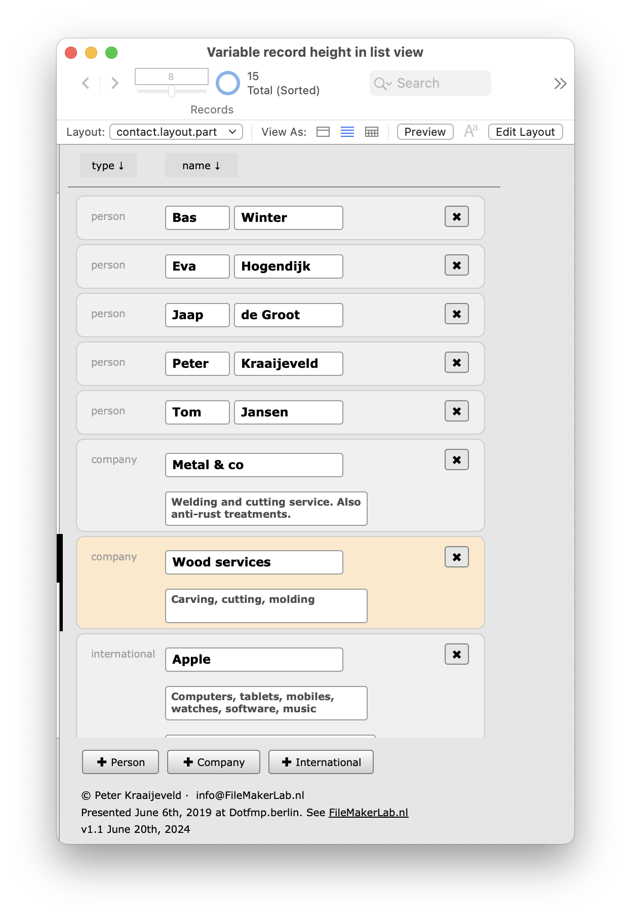
Here it is: a list view with an individual height for each record type.
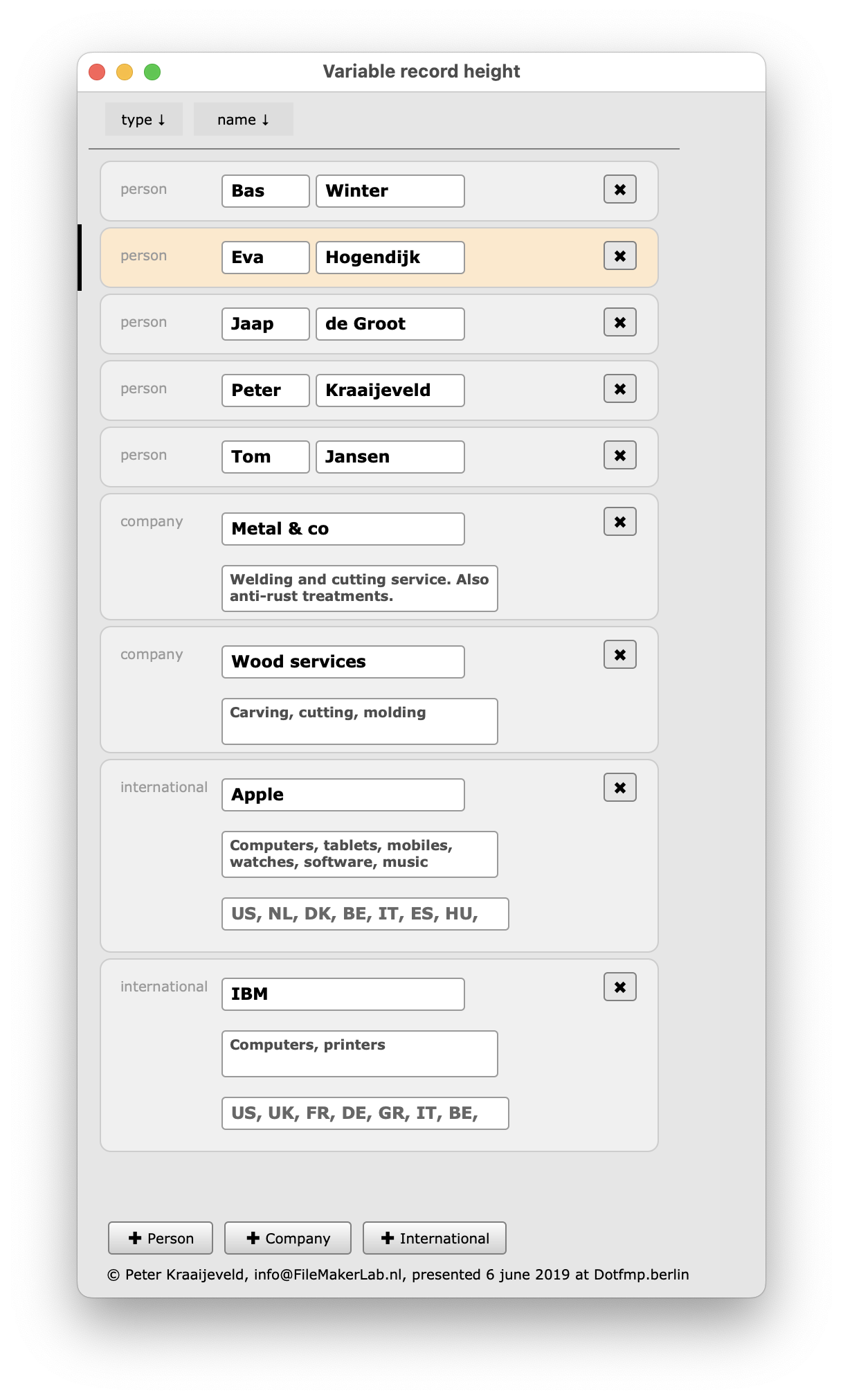
Above a person’s type of record is selected and below a company’s. There’s the common active-record-indicator as well as an extra salmon highlight.
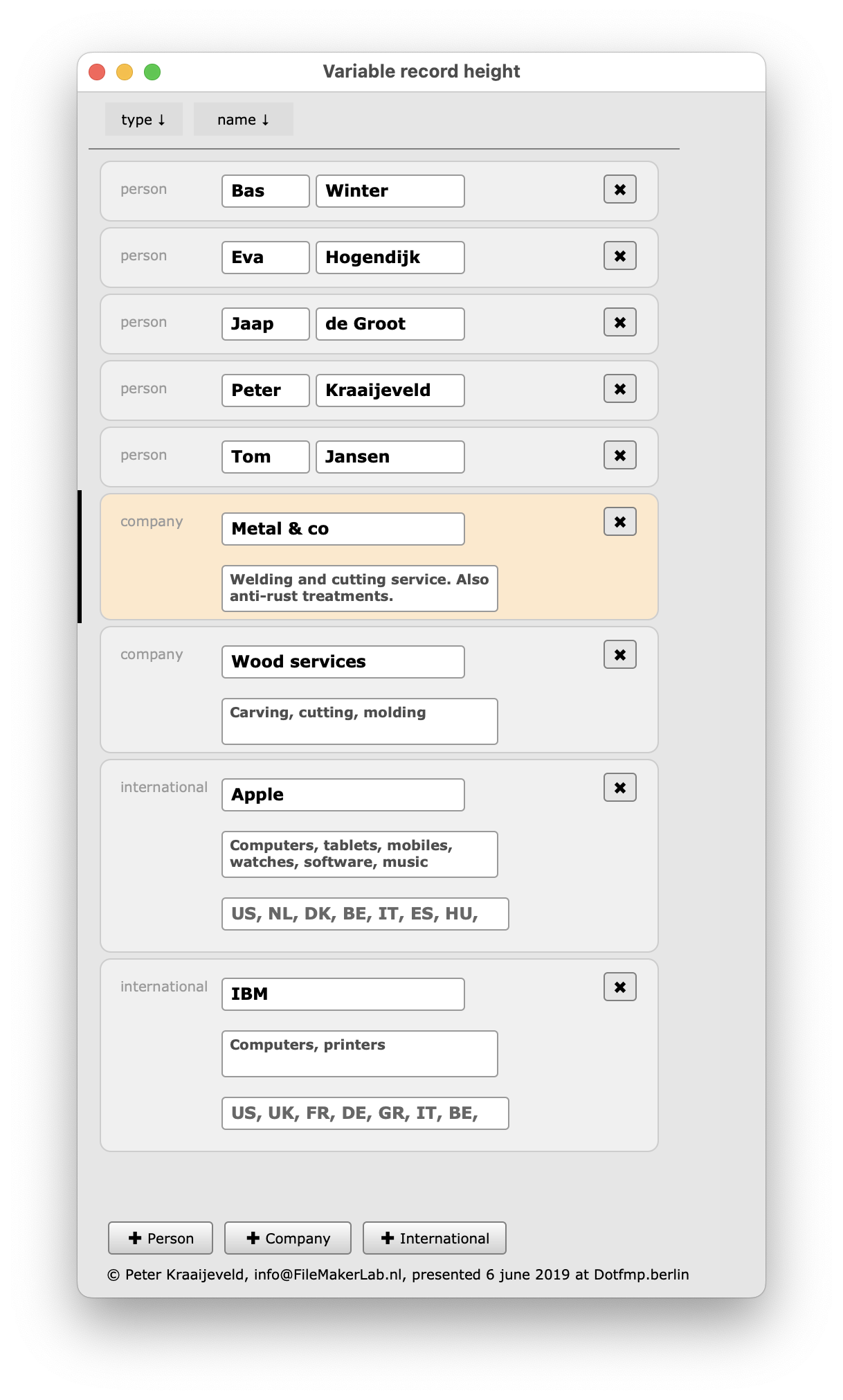
Of course, an extra high record (type International) can be selected.

That’s the how it looks. And the behaviour?
Every record can be selected by mouse, or navigated to by keys (the current ^↓ and ^↑ ).
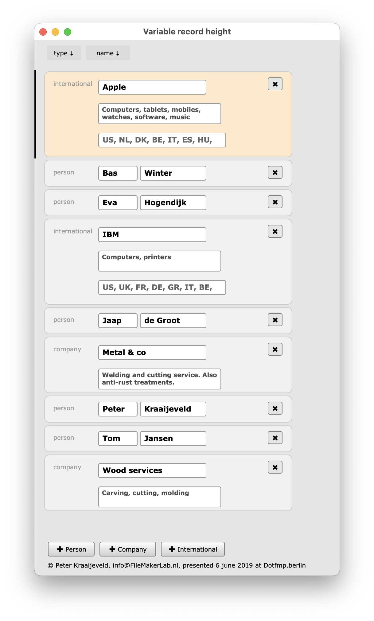
Records can also be sorted as usual. By name (Person’s first name or Company name), with all types in that order:
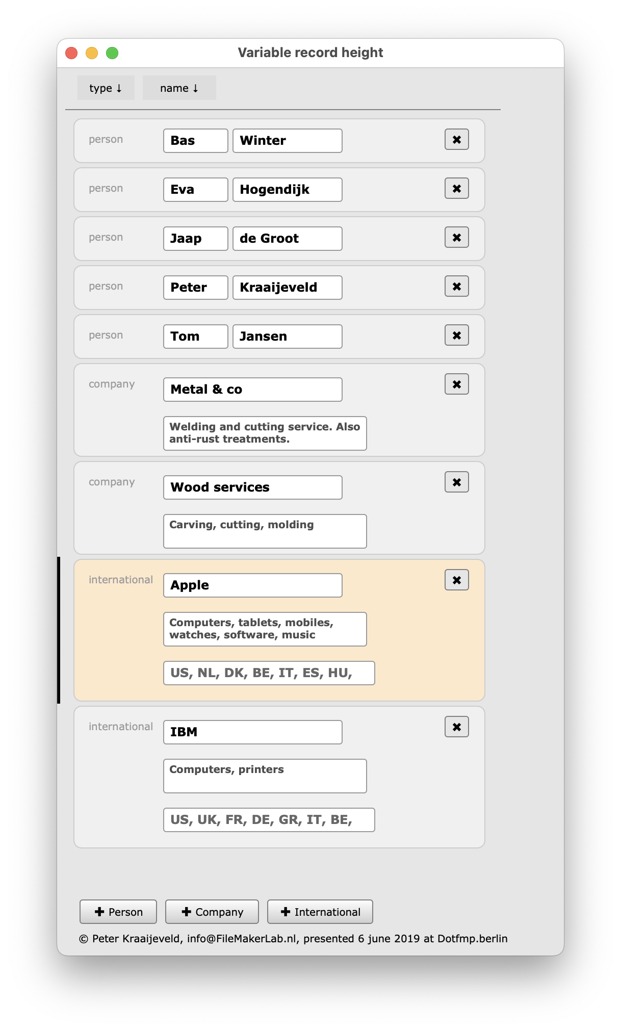
Or the records can be sorted by type first and than their name:
The magic
There is, as usual, a table Contacts, with al the fields.
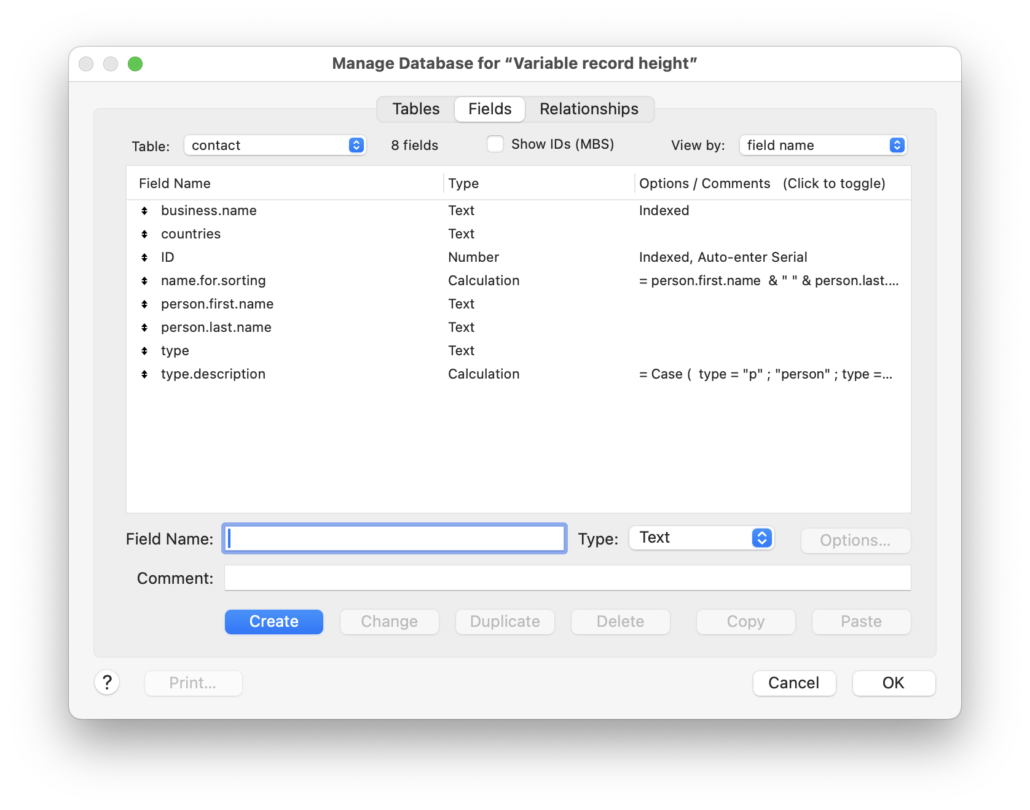
But there is a second, related table layout.part with almost no fields. And this is the table that is shown in the list view!
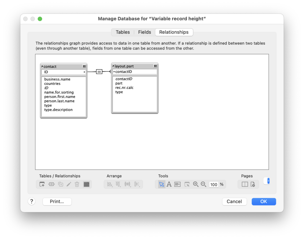
For every record in Contacts there is of course a related record in layout.part. At least. A record of type Person has one related record.
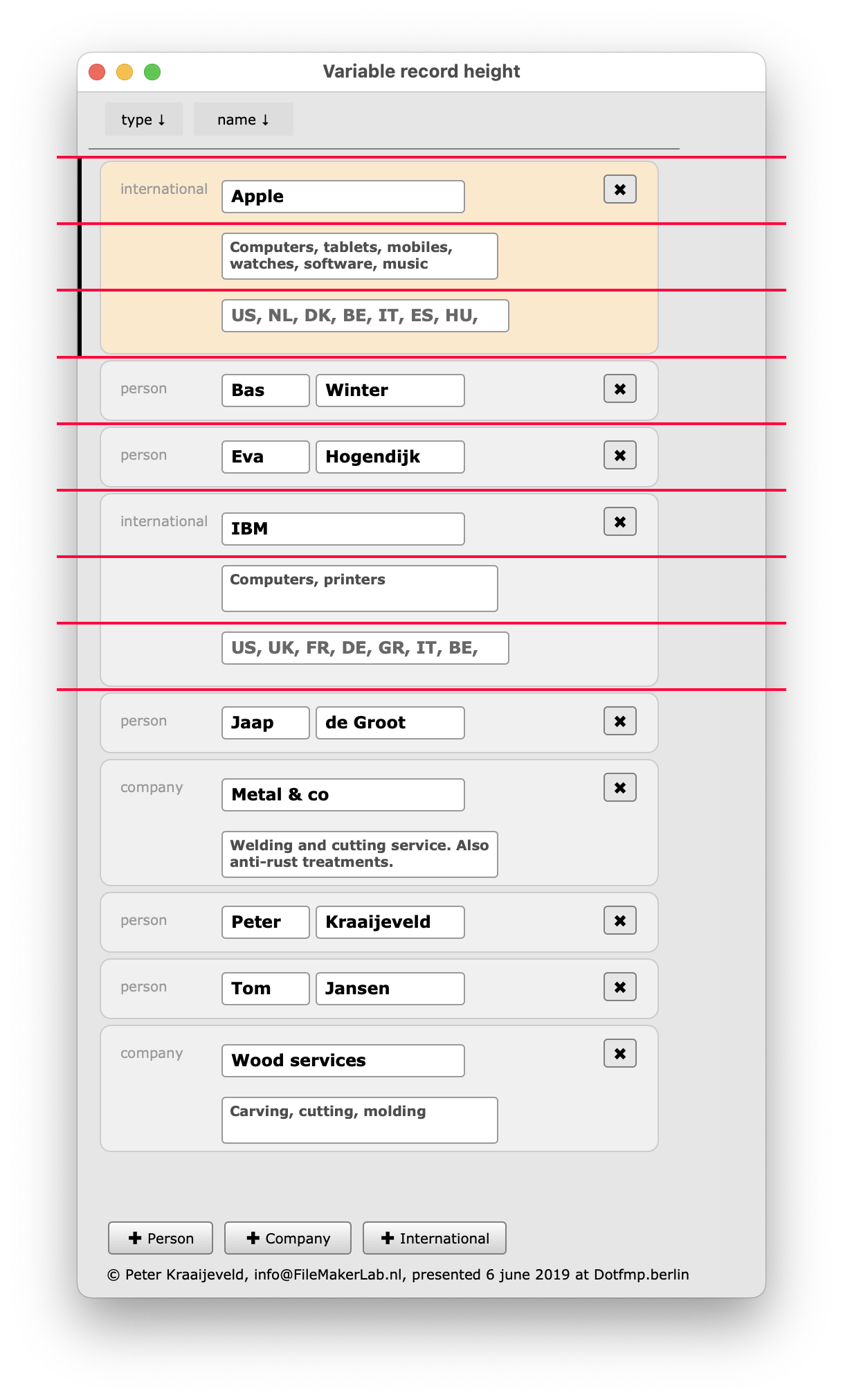
For contact of type company there are two related records. Those two are always shown together, in a fixed order. They are together of course twice as heigh.
An for a contact of type international there are three related records, also always shown together. A top record, a bottom record and a middle record.
Of course its possible to have record types that have 4 or more layout.part records.
The red lines mark the ‘real’ records in the list view:
Visual: fooling the user
The two and three records have to look like one so some tricks have been applied. See the demo file, but these are the most important ones:
The current record indicator is not shown and instead an own record indicator is created at the same location. To fool you it looks exactly like the original, haha!
Of course all the multiple layout.part peer records have the indictator set. It’s done by a visibility calculation.
It’s visible if the record is the (real) current active record or one of the peers. Only the first of the related record can be active but that’s explained further on.
The background element is slightly different for the top, bottom and middle record. The solution is to have them all on the record layout, but depending of the part number (1, 2 or 3) only one is shown.
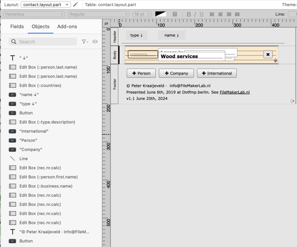
The salmon hiliting of the background part is done somewhat like the visibility of the active record indicator.
Same goes for the different fields.
Navigation by mouse
The user should be able to select a record with the mouse. This still works.
In this case the user can activate all of the related records. That is not a problem at first site, but to keep the trigger and navigation scripts simple I choose to have always the first of these records active and never the others.
I cannot prevent the user of selecting a second or third related record, but I can navigate to the first one after he does. It’s done by the onRecordLoad trigger.
If the user activates a record, the onRecordLoad trigger is fired and the triggered script navigates unnoticed to the first record of the siblings.
There is a complication however. If the script navigates to a previous record then again a new onRecordLoad trigger is fired and that interferes with the intention.
Therefor there is a global variable $$prevenRecordLoad that is set during the running of the script.
Navigation by keyboard ( ↑ and ↓ )
The user should be able to navigate by key: that is ↑ and ↓. Like with the mouse a script should go the first record of the siblings of the previous (or next) contact records. Unnoticed of course.
At first sight you might think of a script doing the same as with the mouse clicking in a record. However, this doesn’t do work as it should.
It’s most easy to explain if you think of what happens after the use goes with an arrowkey ( or ) and lands in a second record of the related siblings. A onRecordLoad script knows about the landing, but cannot not know which record the user comes from. The direction is not nowhere to find.
Also the record part number (1, 2 or 3) you are in cannot not unambiguously tell where the user comes from. Example: landed in related record part 2: does it come from part 1 of the same contact record and then moving downwards? It should then navigate to the next contact record, part 1. Or does come from the next record and moving upwards?
A different solution is needed.
Instead of reacting on the users mouse click, it captures the keystroke with an onLayoutKeystrokeTrigger. See the demo file. In this case the script is trigger while the user is still in it’s current record and the ↑ and ↓ keys can be treated seperately. In this case the script continues to navigate until it’s in a part 1.
Navigating by the native ( ^↑ and ^↓ )
In most solutions the user will use the native FileMaker navigation keys: ^↑ and ^↓. You might thing of adapting the previous keyboardTrigger to these.
But ohlala: onother obstacle then comes up. Try it out and you’ll see: the script doesn’t jump or jums a record to far. Why?
Now an elaborate explanation about event bubbling is needed, but in short:
When the script is triggered by the keystroke, FileMaker has already done it’s own thing with those keys. And does bubble the event downwards. It doesn’t cancel it. Strange.
So if our script wants to go one contact record forward, it’s already done. We can’t be the first in line to capture the keystroke.
We’re really getting out or control now.
But there is a light at the end of the tunnel. I think something else is going on: as the keys are attached to a menu I suspect a menu event is being processed by the OS and Filemaker first and then somehow a separate keyboard event is sent to the current layout. That’s the event that triggers our script.
Thinking this way there’s an easy way to prevent FileMaker from doing anything with the ^↑ and ^↓ keys: remove the menu item. In my demo file it’s been done by duplicating the existing menu set completely, except the Go to record submenu. Then the OS can’t handle the keystrokes, haha !
Sorting the guys
We need a script for sorting but it’s not complicated. The script of course sorts on the fields of the contacts tabel. The only addition here are the related layout records. They should always stay together and ordered in the right sequence (part 1 – 2 – 3). So the layout.part number should be at the and of the sort order. See the demo file.
Another hurdle: if the table is shown by only the name, and two contact records have the same name, can the layout records appear in the wrong order?
Maybe. It’s therefore safe to add the creation date-time of the contacts in the sort order. Or, if they can have been imported previously, the record ID.
In every sort order the last one should be that layout record’s line number.
Create a contact
There’s a script for that. In this case the user has to choose upfront what type of contact he wants to create. The script creates the contact record and the needed related layout records.
In the current demo file de contact type can’t be changed yet. Maybe in the next iteration.
Delete a contact
This is evident.
Further development
A few things are missing but can easily be added.
- The menus can be adapted more to the current scripts (record navigation and crud operations).
- More record operations can be added like the omitting of records.
- Change the record type would be a nice feature, i.e. from
companytointernational. - The solution might work in self-join portals but it’s not shown yet.
Download
Download the demo (version 2024.07.03)
Thanks
Thanks to the audience of this presentation at the international DotFMP conference in Berlin 2019. No-one could guess how it was done and you made me start writing this article.
And Kevin Frank of https://filemakerhacks.com who let me finish it. Thanks Kevin!